Merlin Melanoma Test
creative and art direction, logo design
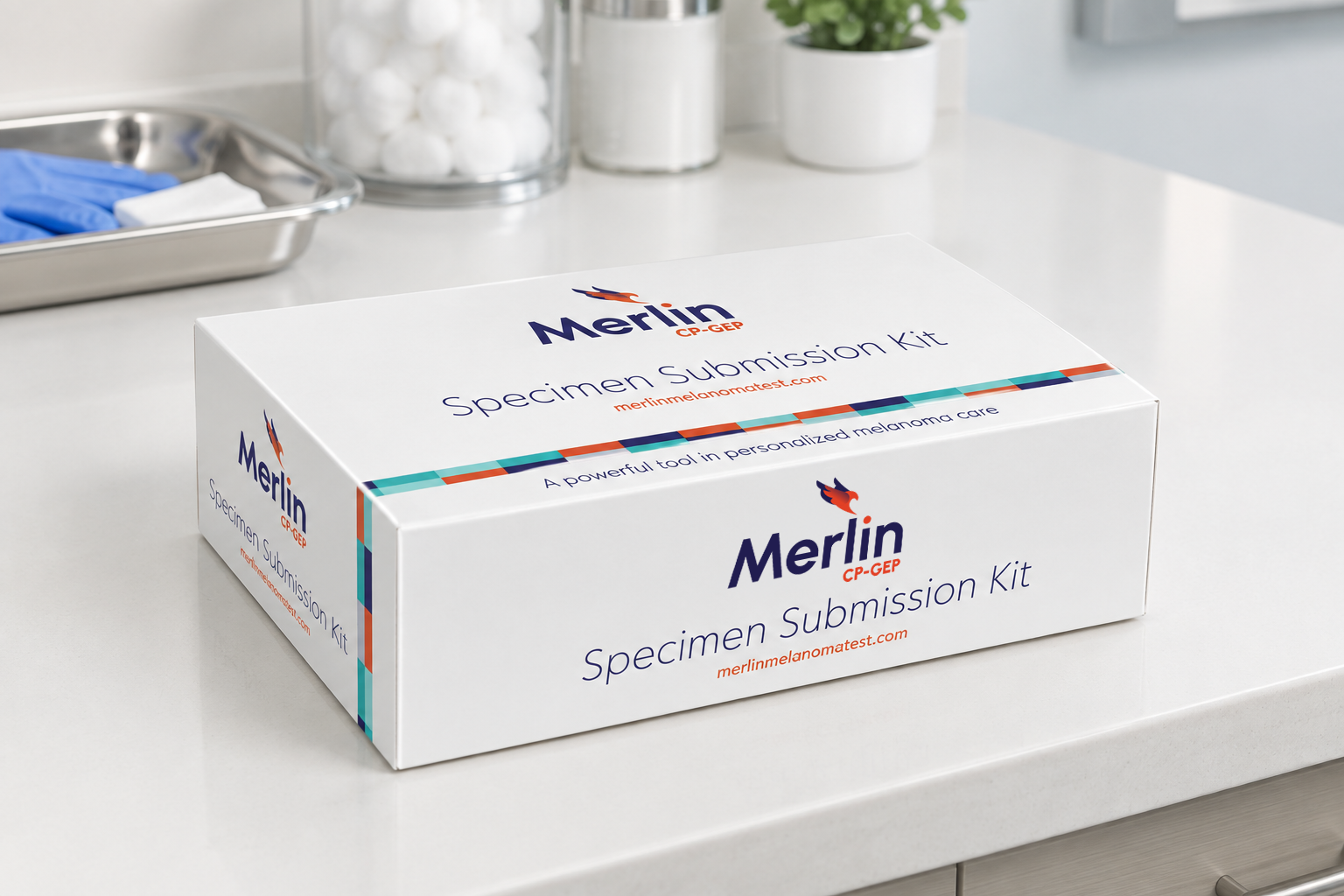
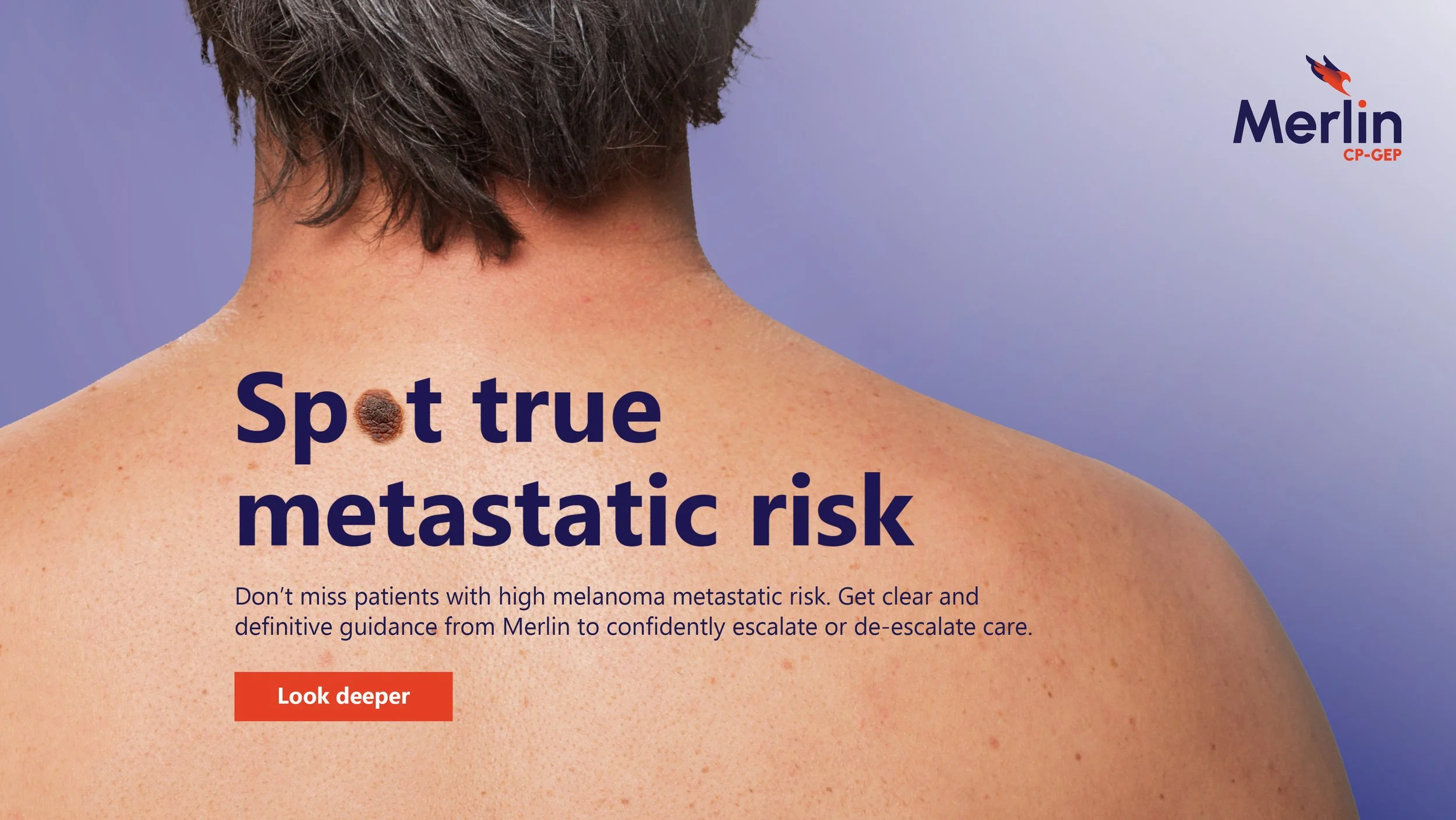
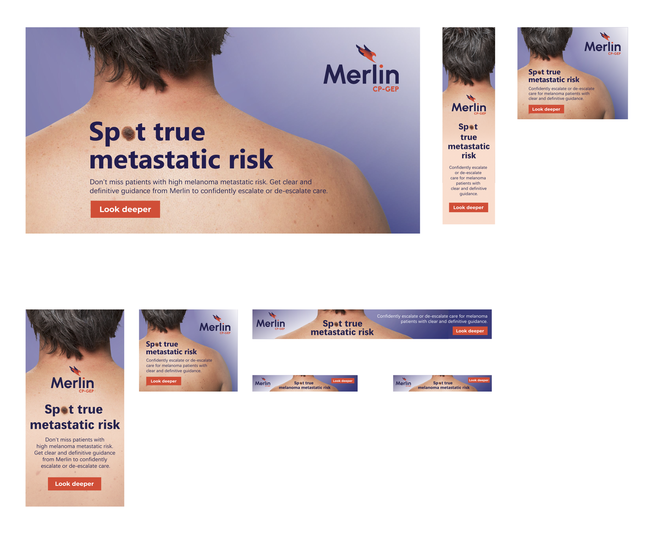
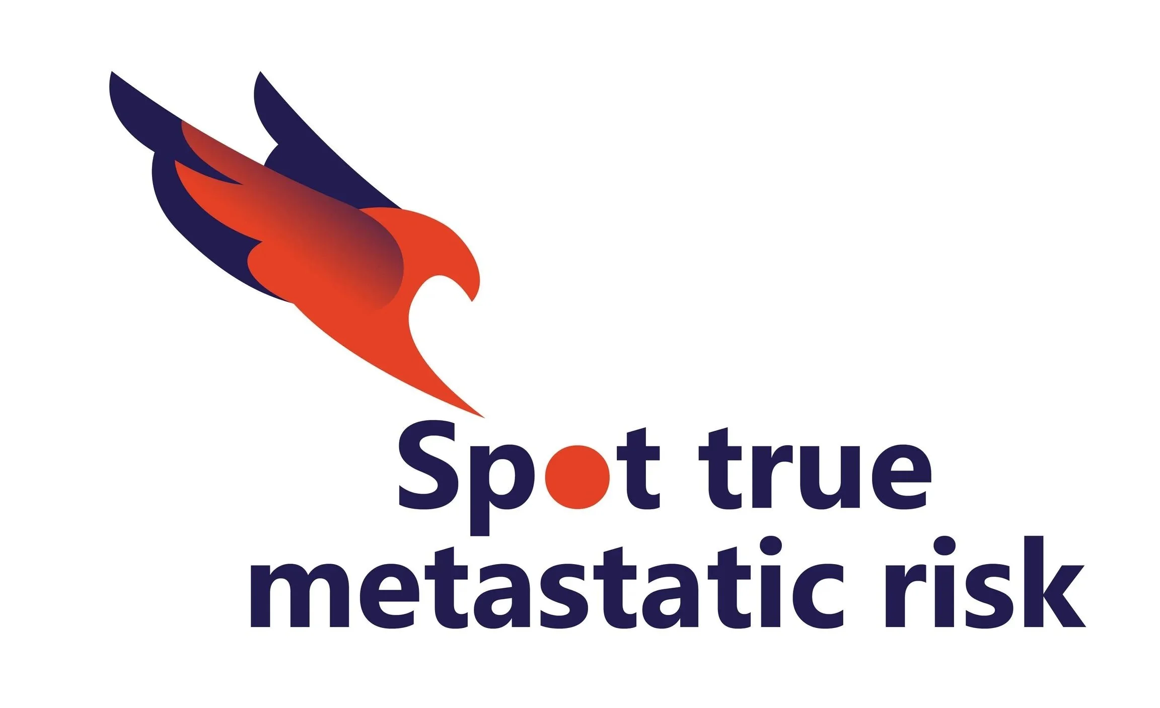
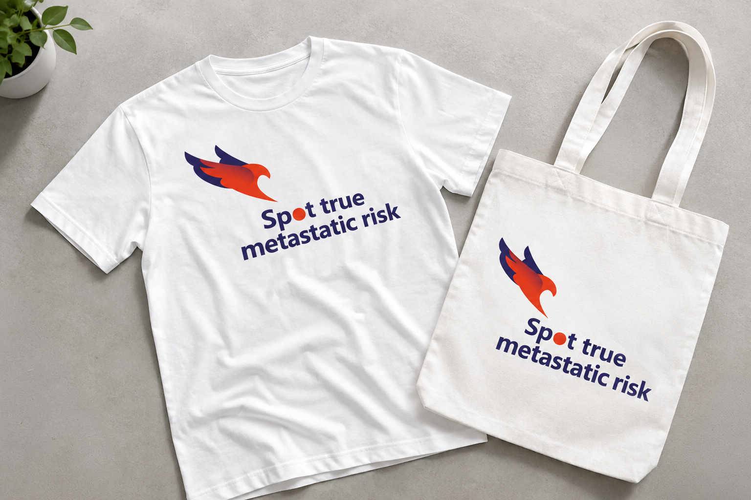
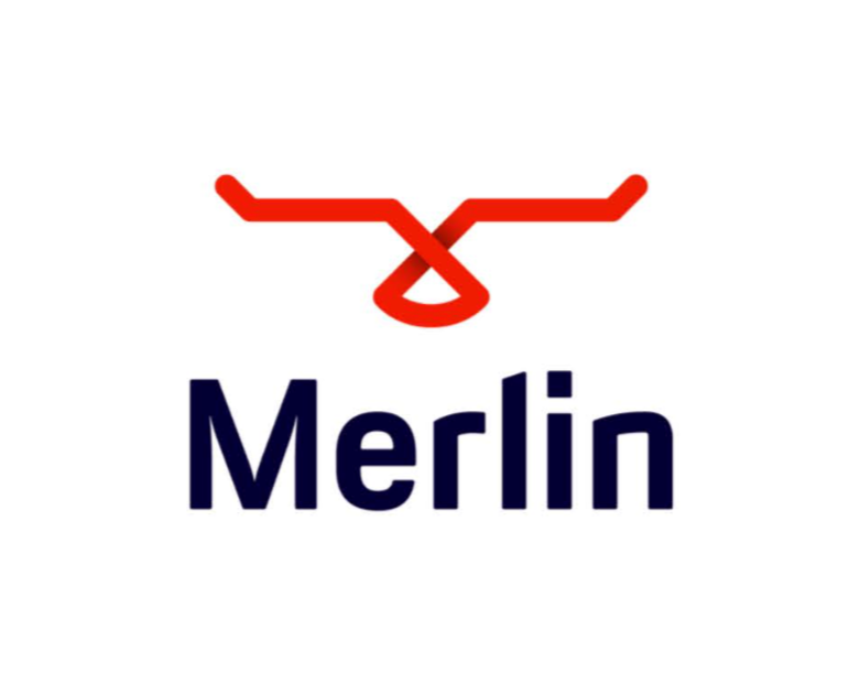
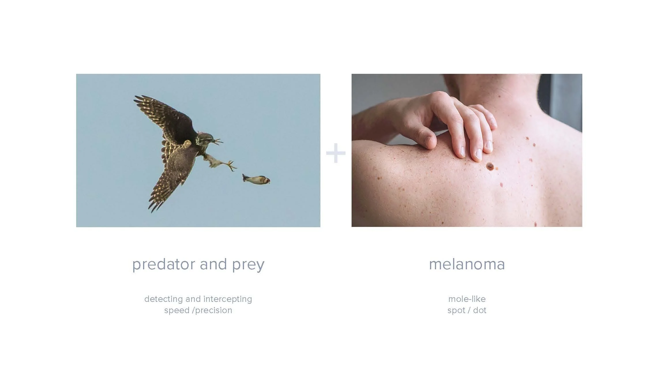
SkylineDx reached out to audacity health for creative support on a logo design and creative concept for their melanoma test. They shared with us how the current logo gets mistaken for bull horns. They wanted something that represented the product more and had meaning. Inspired by the precision and speed of the merlin falcon, the identity connects predator and prey with the visual language of a melanoma spot. The bird as a mark represents focused detection and interception, while the signature dot becomes a visual cue for identifying what might otherwise be missed. A bold navy and orange palette balances clinical credibility with energy, creating a distinctive identity centered around one idea: Spot true metastatic risk.
Logo Design
old logo
thought process
new logo
logo on dark background + greyscale